DS Smith
A digital redesign of one of the leading packaging companies in the world. A new Design System, improved accessibility and navigation.

The challenge
dssmith.com is a large site with a large information structure. To handle the number
of pages and keep the site afloat, we had to plan the process in steps of importance
and content. The design elements were outdated and the best place to start was with
the main navigation and the footer. We then planned to work through the hierarchy
of the site: 1. Start page, 2. Divisional pages, 3. Product pages, 4. Standard pages,
5. Article pages, and lastly a new addition, a Media hub. We worked tightly with the
DS Smith team taking small steps to ensure the site was a float throughout the process.
The solution
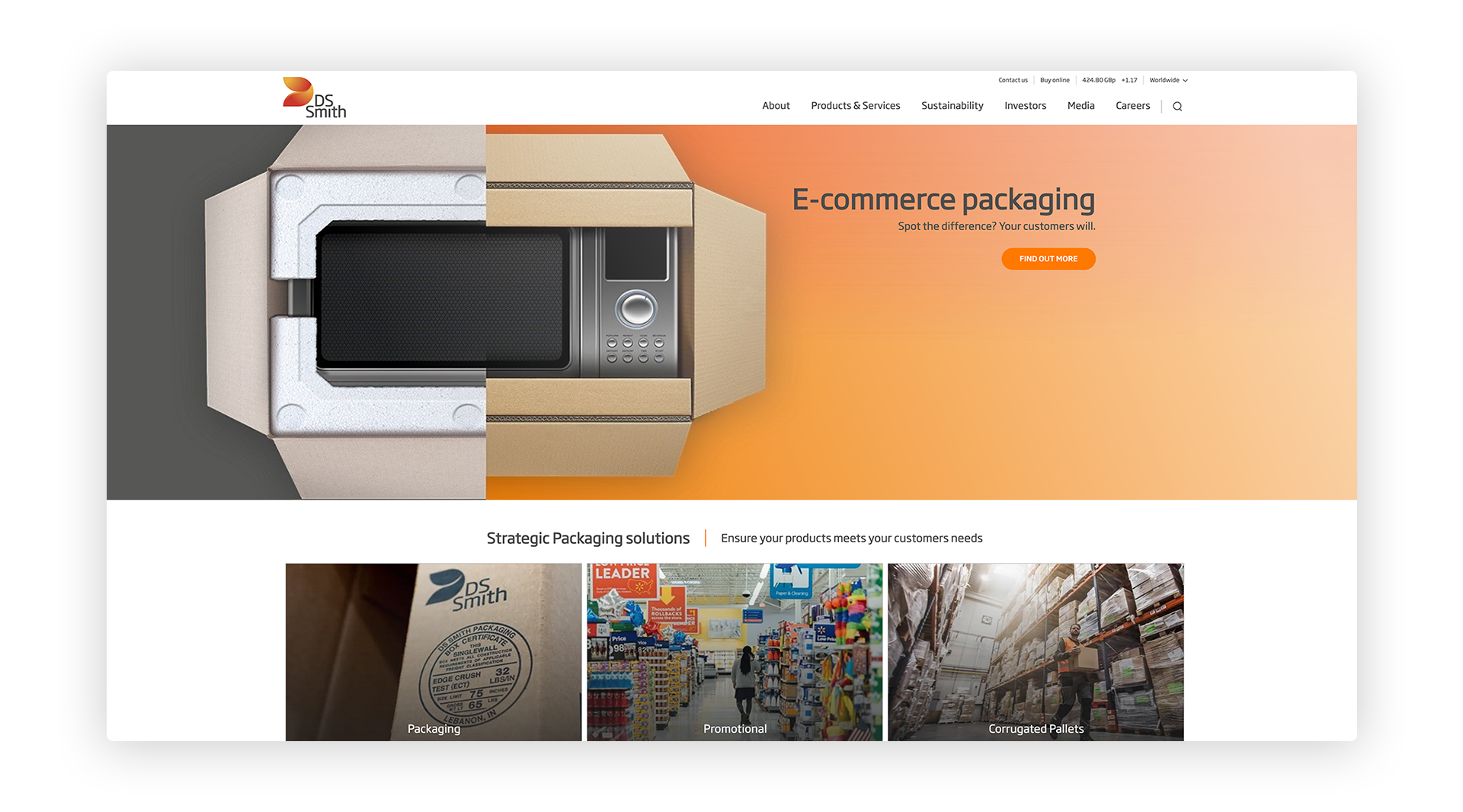
The first step was improving the DS Smith brand and increasing the usability on the site. The brand identity needed a more digital facelift and started by challenging the overall look and feel by strategically increasing font size, color contrast, width of the desktop view, a better mobile experience and much more. Along with a more modern look and feel, we set out to simplify the editor experience. We created individual blocks for all the information. Some blocks are highly specialised and they all can exist independently on the page, no matter in what order they are placed. This way of organising content makes it easier for the editor to plan any new release and also keep the site structured. A lot of information grooming was done parallel to the design work.
For DS Smith, the contact with the customer is key to so many relationships. Inquiries can come through different channels and we wanted to create an easier way for the user to get in touch with DS Smith. In the past, the path for the user was long with extensive long forms to fill out. Now, contact is only a few clicks away.
The benefits
Editors can create tailor made pages with exactly the right content.
The new site structure gave DS Smith the ability to remove old content and as a result, the site is more streamlined.
It's much easier for the user to find the information they are looking for - the customer journey is more direct and the user reaches their goal in fewer steps.
The brand is now modern and the digital part of the brand book is more complete for future projects.
The responsive design of the site now gives the user a better experience on mobile devices.
The insights
- Redesigning a site one part at a time, gives time to go through content in a more thorough way. Not everything is dependent on a large release with hundreds of pages and with DS Smith, the opportunity to go through content parallel to the design work, gave more time to plan the releases and find the right functions to reach the right goals.
- With frequent weekly meetings and clear deadlines, the direction of the project was kept at bay.
Visit DS Smith
Take a look at the site.