Create EPiServer Composer functions with Page Type Builder
Introduction to Composer Functions
Composer functions are essentially user controls. They can also consist of a page type if they require properties. A composer function can be a…
- content function (content block)
- layout function (layout block)
- combined function (layout and content combined)
Create a tab class to add properties to the Composer tab
This is required in order to be able to add properties to the different Composer tabs, both inside edit mode and when editing Composer functions. For information on how to create the ComposerTab class, see my post on how to create a Composer page type with Page Type Builder.
Create a function page type base class
Before we proceed we create a simple base class for our Composer functions, mainly because there are two properties that must always be present:
public abstract class ComposerFunctionBase : PageTypeBase
{
[PageTypeProperty(
DisplayInEditMode = false,
Searchable = false,
UniqueValuePerLanguage = true,
Type = typeof(ExtensionFunctionProperty),
Tab = typeof(ComposerTab))]
public virtual string ExtensionContentFunctionProperty { get; set; }
[PageTypeProperty(
UniqueValuePerLanguage = false,
Searchable = false,
DisplayInEditMode = false,
Tab = typeof(ComposerTab))]
public virtual bool NeverUsedProperty { get; set; }
}
Since we use ETF we inherit the PageTypeBase class, but if you’re using plain Page Type Builder you can simply inherit TypedPageData instead.
Create a new content block
A content block consists of a page type for maintaining the function properties, and a user control for displaying the actual content.
Create the function page type
Create a page type class inheriting the base class we created earlier. It should contain any properties required for the editor to be able to properly work with the content block’s content. For this example we’ll settle for a PropertyImageUrl property that the editor can set to make the content block display an image:
[PageType(
Name = "Image",
Description = "Displays a single image",
Filename = "/Templates/UserControls/Composer/ImageFunction.ascx")]
public class ImageFunction : ComposerFunctionBase
{
[PageTypeProperty(
EditCaption = "Image",
HelpText = "Select an image to display",
Type = typeof(PropertyImageUrl),
Tab = typeof(ComposerTab))]
public virtual string Image { get; set; }
}
Note: It’s important that the property is added to the ComposerTab mentioned earlier, otherwise the property won’t show up when editing the function.
Create the function user control
Next we create a new user control for our content block:

We make the ImageFunction user control inherit Composer’s BaseContentFunction class:
public partial class ImageFunction : BaseContentFunction
{
}
In order for the user control to actually display the image we have to add some markup to it. In many cases, such as when rendering a PropertyXhtmlString property you’d use the <Extension:Property /> control. However, if we’d use that control for a PropertyImageUrl property we’d get a link to the image rendered. That wouldn’t do us much good, so instead we add the following:
<img src='<%= ContentFunctionData["Image"] %>' alt="" />
The ContentFunctionData property can be used to retrieve the value of any function property, in this case the selected image URL.
Set function access settings and rules in admin mode
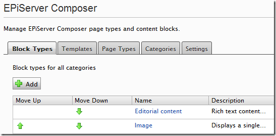
Next we build our project and go to the EPiServer Composer settings in admin mode. We should be able to see our new Image function:
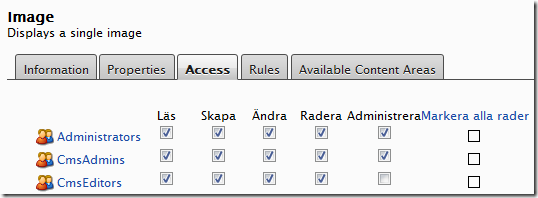
We click the Image function and click the Access tab to set permissions for it (not sure why some of the labels are in Swedish here):
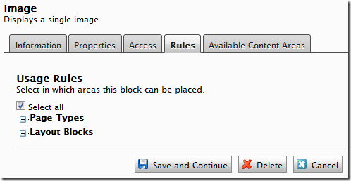
When we click Save we are presented with the rules for the function. I simply check the Select all checkbox and then click Save and Continue:
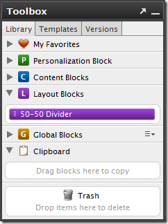
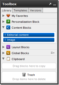
Now, if we refresh our Composer page we should see our new Image content block in the toolbox:
Try the new content block
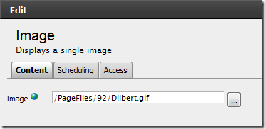
If we drag the Image content block to a content area we can try out the function’s properties by clicking the Edit option:

Since we only added a single PropertyImageUrl property, that’s what we see:
If we click Save we’ll be able to see our content block in action:

Create a new layout block
Let’s create a “50/50 divider” which can be used to divide a content area into two equally sized columns.
First, create a user control just like you normally would…
…and make sure it inherits the BaseContentFunction class:
public partial class FiftyFiftyDividerFunction : BaseContentFunction
{

}
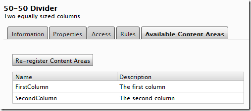
Next, add two ExtensionContentArea controls to it, one for each column:
<div class="fifty-fifty-divider">
    <div class="first">
        <Extension:ExtensionContentArea ID="FirstColumn" Description="The first column" runat="server" />
    </div>
    <div class="second">
        <Extension:ExtensionContentArea ID="SecondColumn" Description="The second column" runat="server" />
    </div>
</div>
In order to make these two columns appear next to each other we’ll add some CSS to style our layout block:
.fifty-fifty-divider .first { float: left; width: 48%; }
.fifty-fifty-divider .second { float: right; width: 48%; }
Next, make sure to build your project to ensure the control’s type has been compiled.
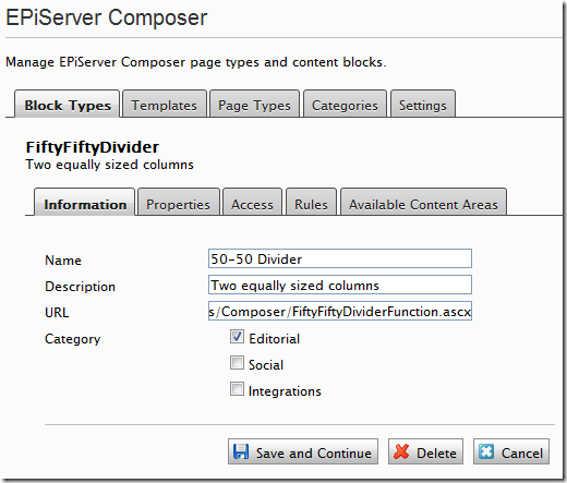
The layout block function must be registered in admin mode under Tools / EPiServer Composer:
If we look at the Available Content Areas tab we’ll see the two content areas we added with the ExtensionContentArea control:
Set access settings and rules
As with the content block earlier we need to go into admin mode to set permissions and rules for our layout block.
Try out the new layout block
If we edit our Composer page we’ll notice the new layout block in the toolbox:
We can now add this layout block to easily place two content blocks in two adjacent columns:
But we didn’t use Page Type Builder?
That’s true. This layout block didn’t require any properties, so we skipped that step. However, in practice we created a page type for the function when we registered it in admin mode earlier.
That’s it!
Any feedback or questions are welcome in the comments section! Happy composing! :)

