Migrated article
This article was migrated from an older iteration of our website, and it could deviate in design and functionality.
8 minutes
We'll add the Adaptive Images add-on to an Episerver website to get an overview of how the add-on works and what it does.
We'll start by testing it with Episerver images only, and then we'll add the ability to use images directly from the image service Unsplash without leaving the Episerver user interface.
If you're not at all familiar with the add-on, there are short to-the-point screencasts available at https://episerverimages.com.
Install the TedGustaf.Episerver.AdaptiveImages package from the Episerver NuGet feed.
Let's start with creating a simple page type with a single property:
[ContentType]
public class MyPageType : PageData
{
    public virtual AdaptiveImage HeroImage { get; set; }
}
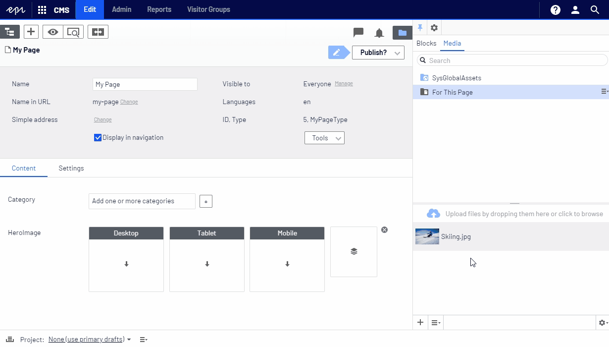
Now, if we rebuild and reload the Episerver edit interface, we'll be able to drag-and-drop Episerver images to the adaptive image property:
By default, the image(s) will be rendered using a <picture> element. So, if we add the following to the Razor view for our page type...
@Html.PropertyFor(x => x.HeroImage)
...markup like the following will be rendered:
<picture>
    <source
        srcset="/AdaptiveImages/episerver/skiing.jpg?width=1920&height=1080"
        media="(min-width: 980px)" />
    <source
        srcset="/AdaptiveImages/episerver/skiing.jpg?width=979&height=551"
        media="(min-width: 768px) and (max-width: 979px)" />
    <img src="/AdaptiveImages/episerver/skiing.jpg?width=767&height=767" />
</picture>
The rendered images will have different sizes for the different screen sizes, based on the default breakpoints.
While the breakpoints may be explicitly specified as parameters to PropertyFor, the defaults can easily be changed:
AddonSettings.LargeBreakpoint = 1280; // Desktop starts at 1280px
AddonSettings.MediumBreakpoint = 768; // Tablet is 768px or wider (767 and below is considered mobile)
To ensure web editors use large enough images (we never want to see blurry scaled-up images on our website), we add a Size attribute to our adaptive image property. This will specify the required minimum size of the original images (the actual size of the images rendered on the website may differ, but we'll get to that):
[ContentType]
public class MyPageType : PageData
{
    [Size(1920, 1080)] // Original image(s) must be at least 1920x1080 pixels
    public virtual AdaptiveImage HeroImage { get; set; }
}
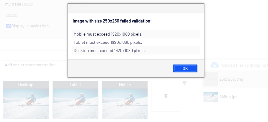
Next, rebuild and reload the Episerver edit interface again. Now, if we try to use an image smaller than 1920x1080 pixels we get an error:
Notice how the constraint applies to all screen sizes. We may instead opt to require different minimum image sizes for different form factors:
[ContentType]
public class MyPageType : PageData
{
    [Size(1920, 1080, FormFactor.Large | FormFactor.Medium)] // 1920x1080 for desktop and tablet
    [Size(500, 500, FormFactor.Small)] // Mobile image must be at least 500x500 pixels
    public virtual AdaptiveImage HeroImage { get; set; }
}
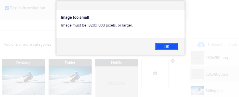
If we rebuild and reload again we'll be able to drag-and-drop an 800x600 image to the mobile form factor. However, if we drop the same image on desktop or tablet we get an error:
This is good! As web designers or developers we can trust that the original image will always have a known minimum size. Web editors won't need to ask what the correct image size should be, and as developers we know that we can crop or scale the image to any dimensions within the size constraint.
In addition to (or instead of) requiring specific minimum sizes, we can instead require specific image proportions.
Let's add a Proportions attribute and require the original image(s) to be widescreen, i.e. 16:9 proportions:
[ContentType]
public class MyPageType : PageData
{
    [Proportions(16,9)] // Images must be widescreen format, i.e. 16:9
    public virtual AdaptiveImage HeroImage { get; set; }
}
After rebuilding and reloading we will notice that the thumbnails are now 16:9.
This is because the Proportions attribute requires the images to be 16:9 for all screen sizes, so the image(s) have been auto-cropped to the correct proportions.
We also notice that if we click the scissors icon (while hovering over a thumbnail) to manually crop an image, we're limited to 16:9 proportions:
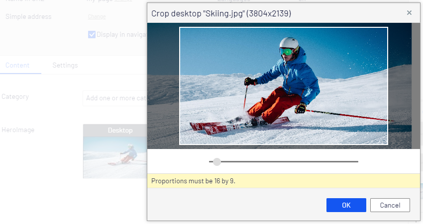
This is easy! Not only does this allow the images to be automatically cropped to the correct proportions, it also allows web editors to fine-tune croppings to ensure the right parts of the image are visible on the website.
Now, let's combine constraints to ensure images are large enough and have the correct proportions for each screen size:
[ContentType]
public class MyPageType : PageData
{
    [Proportions(16,9, FormFactor.Large | FormFactor.Medium)] // Desktop and tablet images must be widescreen format, i.e. 16:9
    [Proportions(1, 1, FormFactor.Small)] // Mobile images should be square
    [Size(1920, FormFactor = FormFactor.Large | FormFactor.Medium)] // 1920x1080 for desktop and tablet (height is derived from proportions constraint)
    [Size(500, FormFactor = FormFactor.Small)] // 1920x1080 for desktop and tablet
    public virtual AdaptiveImage HeroImage { get; set; }
}
To see how external DAM systems can be used, install the TedGustaf.Episerver.AdaptiveImages.Unsplash package from the Episerver NuGet feed.
Note that a developer license (free) is required to try the Unsplash image provider. You can get one at https://episerverimages.com/buy (select the Developer licensing option).
Next, rebuild and reload the website to have the "Image bank" component appear, enabling you to search for images on Unsplash (optionally filtering by proportions) and use them for adaptive image properties:
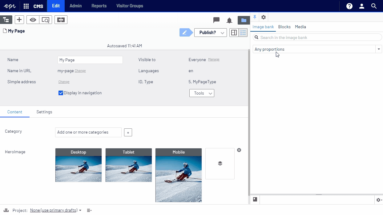
Note that you can now use both Episerver images and Unsplash images side-by-side, even within the same adaptive image property. Web editors and developers have the same features available regardless of where the image originated.
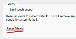
Note: You may need to click Reset Views in user settings for the "Image Bank" widget to appear:
In upcoming blog posts we will learn how to:

Ted is the founder of ted&gustaf, a technical architect and Optimizely MVP with over 15 years of experience designing and leading the development of complex digital platforms.