Migrated article
This article was migrated from an older iteration of our website, and it could deviate in design and functionality.
10 minutes
A lot has happened and to match our internal journey with how we present ourselves as a company we decided to update our brand to reflect that. We started with evaluating and polishing our profile which lead us to our new brand, website, branded clothing and a team ready for anything coming our way! We've described our process and the strategy behind our work below.
As with most projects you need well defined goals to be successful in reaching expected results and outcome. Our focus has been to create a profile reflecting what we as a company are, where we want to go and to launch this as part of our ten year celebration.
In order to succeed with this, we needed to identify which steps should be included and when each step had to be ready in order to define a realistic time plan. The first few questions we needed to answer were; who are we? What's different today compared to when we started up in 2010? Where do we want to go?
We've worked continuously with our vision and mission over the years, making this a good place to start when reflecting on our identity, our history and future. A big part of what differentiates us today from where we used to be is that we've broadened our offer and hold more areas of expertise today. What's still true today and has characterized our way of working since the start is our customer first mentality, as well as both individual and collective development through having the right attitude and sense of community.
To be able to define which keywords should lead us through the process, we carried out a number of workshops, providing the following outcome:
Having established these keywords, we carried on creating our new logotype.
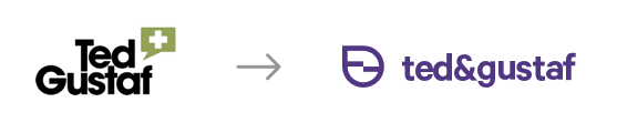
The ways of approaching a new logotype are almost as many as there are logotypes. We didn't want to limit ourselves and chose to brainstorm with both the existing logotype in mind as well as completely new ideas. At the same time, we wanted something that would work detatched from the name of the company.
The work with the new logotype resulted in the following changes.
We have thought a lot about the fact that the company name consists of two personal names. This goes against how we want to be perceived when we are in fact one unit, one team. We therefore chose to remove the spaces in the name and thus create the impression of one coherent name or word. We now write it as ted&gustaf. Along the same lines, we wanted to merge the T and G in the symbol. By using different parts of the letters and merging them together we landed in the following construction:
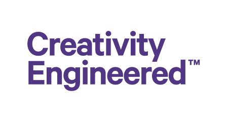
We have used a tagline since the beginning that we feel is very fitting for what we do; Creativity Engineered. This is a suitable representation of our creative and inquisitive mindset along with our sense of pride in the craft of programming. We have therefore chosen to keep it, but to update the font.
The logotype is a big part of a brand of course, but a preeminent brand is so much more than just the logotype. Everything between how we as a company make people feel to the messages we communicate. Taking all of this into consideration, we've also spent some time working through the tonality, language and types of images we want to use in order to communicate what we want.
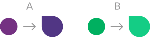
There's a lot that could be considered to be subjective when it comes to colours. Opinions and taste will always be individual. A lot of people don't perceive colours the exact same way either. Someone thinks a turquoise colour looks more like green, whilst someone else perceives it more as a blue colour. Another factor to take into consideration is visual impairment. All things considered, colours are still very much affecting how we register objects. There is a lot of information available concerning the science of colours, different colours psychological effect and the associations they provide. Editing our profile colours, we took a closer look at how we communicate what we want with our colours alongside preserving what has been characterizing T&G for a long time - the green and purple. The work we did resulted in preserving the green and purple as our main colours, but with updated tones.
There is a lot of material to revise when going through a reprofiling. Everything between presentation materials and website updates to contracts and office decor. We created a graphic manual collecting everything from typography and colours to logotype, how to use it and how we express ourselves, as a future internal tool which we wanted to make easily accessible and which would serve as a foundation to the reprofiling. A collection to refer to when needed for how we communicate or what's what when it comes to our brand, to ensure everyone in the team communicates in a uniform way.
Updating our website could have been a minor adjustment if we had chosen to only update changes such as fonts, colours and content. To strengthen our competence by following our own advice, we chose to create a completely new website. With technology changing daily, this provided us with an opportunity to update the website and optimize performance.
The most intense part of updating our profile might be over, but this is an iterative process just like other projects and we'll continue to develop our profile continuously over time. It's been a rewarding process working with reprofiling and by largely involving the whole team in the process we've increased engagement and unity around our brand. We've been given time to reflect over what we are, what we've been and what we strive to become.
