Migrated article
This article was migrated from an older iteration of our website, and it could deviate in design and functionality.
9 minutes
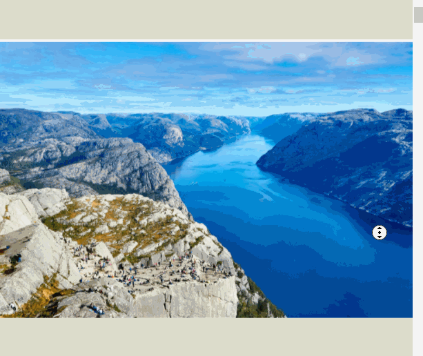
Recently I was tasked with implementing a parallax effect on a web application's hero image. The requirements were the following:

Naturally, for ease of use and performance reasons, I delved into the world of CSS parallax.
As many articles and blogs out there today will tell you, the way to implement CSS parallax is to wrap the content of the page in a containing element with 100% height and a perspective value, apply translateZ- and scale-transforms to any element you would like to parallax and voila, you're done!
While this may hold true for many use-cases out there, I quickly found out that this wasn't quite enough for what I needed. Below I list the numerous issues I encountered.
First off, I realized that 3d effects are not preserved in certain browsers if there are elements between the perspective wrapper and the parallax element. As the hero image I was trying to parallax was nested a few React components deep in the component tree, the parallax effect was lost.
The common solution here is to add transform-style: preserve-3d; to each in-between element to enable it to continue propagating any 3d effects. This presented another problem in the already existing codebase though - propagating 3d effects throughout the application meant that I couldn't use z-index anymore to control elements' stacking order. In this case, I managed to work around the issue by making sure there are no such in-between elements by moving the hero image up the hierarchy.
When playing around with the image's height and resizing the viewport (i.e. the browser window), I could see that the image was not scaled up enough if the viewport's height was larger than the image.
This makes sense when you think about it. If the image is parallaxed and the viewport is higher than the image, then there will be a gap when you scroll past it since the image scrolls slower than the rest of the page. To solve this, I used some javascript to add additional scaling to the image when resizing the viewport. The reverse is also true if the viewport's height is smaller than the image height - in that case, we actually do not need to scale the image up as much as its z-translation would otherwise require.
Another solution here could be to scale the height of the area that the image covers directly by setting the height to a percentage of the viewport's height. This would mean that the image occupies a variable height of the page.
Since transformed elements create a new containing block, and setting perspective causes a transform to be applied, any element with position: fixed; inside the perspective wrapper will instead be absolutely positioned. This means that position: fixed; does not work inside a perspective container.
Fixed positioning for elements outside of the perspective wrapper do work though. However, if the fixed element is full-width, we end up with it covering up the application's scrollbar. This is because it covers the perspective container element, which is our "window" element.
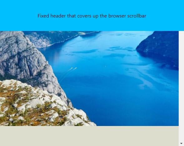
To keep having a fixed full-width element, we can resort to using javascript to set the element's width according to the perspective container element's clientWidth, which excludes its scrollbar.
Another solution for having semi-fixed full-width elements at the top of the screen such as a header, is to instead use position: sticky; which does work inside a perspective wrapper. Sticky positioning doesn't work very well for other types of fixed elements though, such as a footer.
With a perspective container element the window object in javascript cannot be relied upon for scroll events anymore. Since the perspective container element is now effectively our new window object, any "window" scroll event listeners should attach to that element instead.
Mobile browser-specific behavior is impacted negatively. Some mobile browsers, such as Chrome for Android, have specific behaviors for their address bar and other features that depend upon the user scrolling the window element. This means that the address bar may not show or hide properly while scrolling through the page, at least not until you have scrolled all the way to the end. I have not found any satisfactory solution to this - I would recommend to disable CSS parallax using media queries for small screens, where the parallax effect is not as noticeable anyway.
Using scale-transforms may result in blurry text. You might be able to work around this in certain cases by skipping scale transforms entirely, and instead opting to manually increasing the width, height, and font size of your elements. Note that this might produce anti-aliasing issues in some browsers though, so it is recommended to use CSS parallax mostly on images and backgrounds.

CSS parallax can be a great contribution to the aesthetics of your website and at the same time be very performant, but there are many hurdles to overcome which adds complexity and development time. Once you know about the short-comings of the technology however, they become easier to manage. Hopefully this article will allow you to focus more on the great look and feel CSS parallax can give to your website.
