Quick and dirty focus styles
6 minutes
The need for focus style on your web site
As a web developer you may often find yourself in either of these situations. You either have a gorgeous design in front of you that doesn’t include focus styles, or you just want to whip up a quick focus style that matches the brand colors for the site.
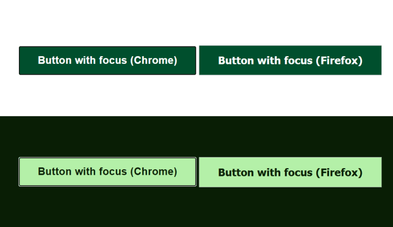
Focus styling of interactive elements is important to keep your website accessible to a wider range of users. The default styles in web browsers can be enough in some situations, but some lack contrast to dark backgrounds and it just looks nicer if the focus ring matches the colors on your site.

The default focus styles can be hard to see in some situations.
Using the design to your advantage
Let’s say you have a color palette for your website with carefully selected colors to make sure that the contrast ratio between text and background meets WCAG level AA or AAA. Knowing this, you can assume that whatever text color is used will have a good contrast ratio relative to the background color. This allows you to create a base focus style using currentColor.
Creating a base focus style using currentColor
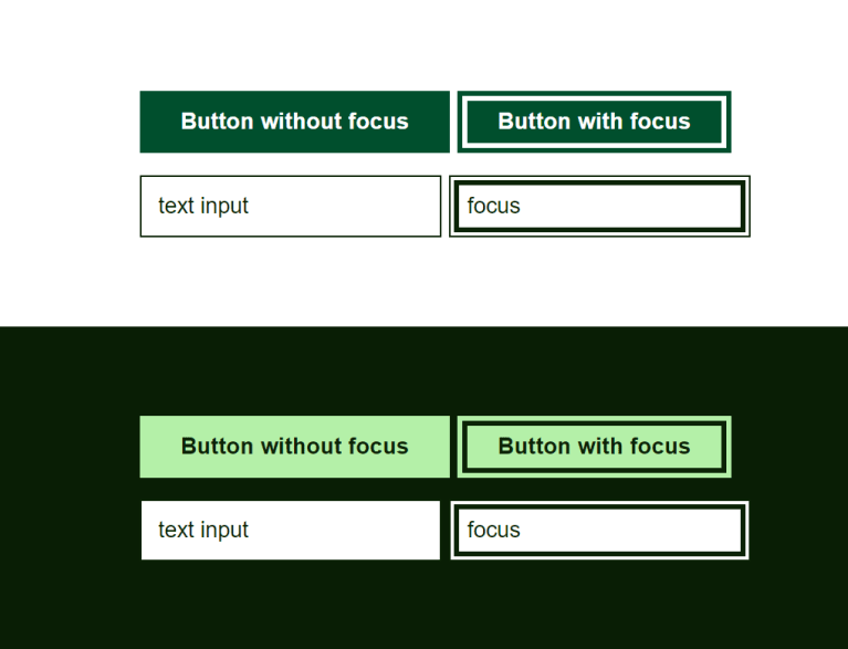
Based on the assumption that the text color already has sufficient contrast to the background you can create a focus style for inline elements by adding an outline using currentColor and an offset to leave some air around the text.

:focus {
  /* optional fallback style */
  outline: 3px solid currentColor;
  outline-offset: 2px;
}

:focus:not(:focus-visible) {
  outline: none;
}

:focus-visible {
  outline: 3px solid currentColor;
  outline-offset: 2px;
}
Buttons are a bit different since the text color is set relative to the button color and not the background that the button is placed on. If your buttons are big enough, you can use a negative offset to render the outline on top of the button.
Text fields used on bright backgrounds could have an outline outside the element, but to guarantee the contrast even when a text field is placed on a dark background (e.g., a search bar) you could use a negative offset just like with the buttons.

button:focus-visible,
input[type="button"]:focus-visible,
input[type="search"]:focus-visible,
input[type="submit"]:focus-visible,
input[type="text"]:focus-visible,
textarea:focus-visible {
  outline-offset: -6px;
}
Customizing components
The idea is to use this as a simple base style across your site and to make customizations in components that have a special look or behavior. You may need to change the offset or color of the outline in some cases and if you have rounded buttons, you can simply make a specific focus style for buttons using the same principle, but for example using a box-shadow and border instead of an outline. You simply have to override the outline property.

.button-rounded {
  border: .3em solid var(--button-color);
  border-radius: 2em;
}

.button-rounded:focus-visible {
  box-shadow: inset 0 0 0 .2em currentColor;
  outline: none;
}
Compatibility
When it comes to compatibility, legacy (pre-chromium) Edge and Internet Explorer don’t support outline-offset fully. If you use :focus-visible that problem solves itself and those browsers will use their default focus styles. Otherwise, you’ll have to make a fallback for those browsers. At this date focus-visible is still quite new, but there are polyfills you could use for browsers that don’t yet support it or you could add the focus styles to the same elements as focus-visible and toggle the styles on and off by toggling a class on the body element when a user switches between using a keyboard (hits tab) and a mouse (clicks) using JavaScript to avoid lingering focus rings on buttons.
Taking it further
Even if you end up not using the styles in the end, it could be a good idea to add a visible focus style to the site to aid communication between designers and developers. Then you’ll have a starting point for discussion. All while having an accessible website.
Conclusion
There are many ways to make your focus styles look great. Hopefully, you’ve gotten some inspiration for creating your own styles or used the method above to get yourself out of a pinch.
Resources
