Migrated article
This article was migrated from an older iteration of our website, and it could deviate in design and functionality.
4 minutes
I'm certainly not alone in trying to predict the trends of 2021 and for good reason. Establishing patterns and implicit meanings of shapes, colors, movements and symbols is a big part of the work as a UX/UI designer. Trying to push the boundaries, renewing, evolving and improving design and user flows whilst maintaining interfaces that are efficient and intuitive to use.
Some design trends are generic and may influence all industries and fields, while others may differ depending on the audience, business field and business goals. During 2020 we've seen a lot of innovative typography, 3D realism, geometric designs and isometric illustrations. This have resulted in great, innovative and creative designs. However, as always within the field of UX, we need to adapt our designs to the users. In the end, that's all that matters. For instance, a quirky, playful font may not be appropriate for, say, a law firm, funeral business or bank. On the other hand, we can use unexpected design elements to draw attention to certain sections or objects of a design, if necessary. We should be bold and experiment, but always test and validate the hypotheses with the users.
So what can we expect to see and explore more of in 2021? Let's dive right in.
The expression "less is more" is as true today as ever. Minimalistic design has been a common trait of many websites for the last decade. The greatest benefit is by taking away what isn't necessary you allow the user to focus on the objective at hand and more easily achieve their goal. I don't see this going away anytime soon. Today we're more aware than ever of user behaviors and we have the tools to track, analyze and learn. The more we know, the more we can anticipate and use this information to guide the users. Using a minimalistic approach we remove what is less frequently used or needed and highlight the primary action(s).

Sketch has a minimalistic approach to their website, keeping focus on the product and how to get started
Proper typography is key to a successful web design. Bold typography can be a useful tool to make a prominent statement. It's especially effective if it can answer a user's need in just a few words in a selling manner (take Abstract for example; "Design collaboration without the chaos"). Bold typography is best used to emphasize and demonstrate visual hierarchy. It works very well when combined with another tool for visual hierarchy; white space. Another benefit of bold typography is the readability, provided it's used in a proportionate quantity. If everything is bold, then nothing is bold.

Bold typography is used by Carnival Sounds/Spotify to distinguish each text section and call for the user's attention

The Swedish version of WWF uses bold typography to let the user quickly scan the page's content
A term that's grown quite popular lately is glassmorphism, which essentially means a frosted-glass effect using blurred backgrounds, usually combined with a colorful gradient as a layer below the glass to increase the effect of the blurred transparency. This effect was first introduced on a larger scale in 2013 with iOS 7, although the term glassmorphism may have been adopted later.
Smooth gradients and blurred backgrounds are very easy on the eye and presents a calm, natural color flow. It's an effective way to give more life and add playfulness to the design without too much distraction.

Stripe uses a colorful and blurred gradient as part of their hero on the startpage (and there is also some glassmorphism at play)
Squares, rectangles, triangles and circles. The very basic of geometric shapes. They've been used for many years in web design in different ways, but recently more irregular and asymmetric shapes tend to populate designs. It's a simple way to keep the design interesting. It can be the use of a wave-like shape to distinguish between sections or a deformed circle. Soft, rounded edges make the design smooth and calm. I anticipate both simple geometric shapes and irregular asymmetric shapes to be used a lot as decorative figures. The latter will likely be used as a transition between sections as well.

Sketch uses simple geometric shapes to decorate and frame other content, such as images

Concept design on Behance from Eliana Alejandra on Behance using a smooth asymmetric shape to distinguish between sections
Neumorphism (the fusion of new and skeumorphism) is a combination of realistic looking, layered design (using simulated depth and shadows) and a simplistic flat design that's been popular for a few years, where Material Design has been a major player. Similarly to this concept, I think that illustrations that are a mixture of realism and caricatures or cartoons will be trending as complementary figures or part of hero banners.

Mailchimp decorates their startpage with a simple, quirky illustration

Hubspot uses semi-realistic illustrations to playfully welcome and engage their users
2020 presented many challenges, where we had to learn to work from home more extensively and communicate and collaborate digitally. Many businesses where personal meetings traditionally were at the core of their service had to evolve their operations and how they can engage their customers without meeting them. The eye-opening conclusion is that it works very well by giving the users the tools to experience, modify and test different products in a simulated environment, be it customizing cars, houses or shoes. I anticipate this to just keep growing and be incorporated in more and more businesses. We at ted&gustaf have recently helped Älvsbyhus to build a house configuration tool to simulate and visualize a customization of users' dream house.

Älvsbyhus provides a VR service where you can customize and visualize your dream house
Transitions or animated movements are very easy and powerful ways to provide the user with visual affirmation of an action. It may be to provide insight of what will happen from a certain action or what has just happened, if an intent has been accomplished or failed. I've written another blog post titled Using animations to remove the discrepancy between design and implementation if you're further interested in the topic of animation.
Micro interactions are small visual cues to give the user more information. It could be letting the user know an element can be interacted with, showing that something is or has changed or giving a hint of what will happen from a particular action. Not necessarily always easy to implement, but these small adjustments give the user a more natural flow and an intuitive design which is why I think its usage and importance will increase over 2021.
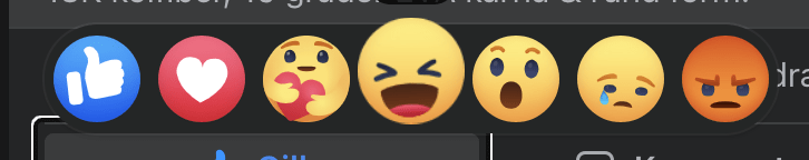
Facebook uses animated emojis to emphasize each reaction
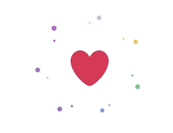
Twitter uses a confetti like animation of the heart when liking a tweet
It may appear contradictory, but as much as I see vibrant and colorful gradients be a trend during 2021, I believe monochrome and duotone designs will have their places as well. We can reuse the less is more expression for colors too. By reducing the number of colors in a design we make it easier for us to (de-)emphasize each element's importance. A limited palette makes it easy to achieve greater contrast values, which brings us to the final trend: legibility, readability and usability.

User Experience Database combines monochrome, minimalism and semi-realistic illustrations
Making the web accessible to everyone is key to not limiting your potential demographic. The combination of several of the mentioned points will be beneficial for increased contrast. Bold fonts usually offers great legibility while monochrome/duotone designs increase the readability. Decluttering and simplifying a design means clearer focus points and thereby increased perception of information and available actions. All points brought up in this article contributes to improved usability and as stated in the beginning - in the end, all that matters is that the website or app is useful and usable by the user.

You can use a service like Gridlover to generate appropriate font sizes based on different readability principles, like the golden ratio.
These are some of the concepts I think we'll be seeing more of during 2021. There is always a thin line between pushing the boundaries of conventional patterns and sticking to already established concepts. We need to adapt to the users, since fundamentally, the goal of the UX/UI process is above all to identify the users' challenges and how to improve on them. At the same time, we need to challenge the users and what we think we know to improve and evolve. Be bold, do experiments. Just remember to always test and validate the hypotheses with the users.
If you're interested to hear more about us, want to work with us or just want to have a conversation about UX/UI or any of our other fields, feel free to reach out to me or my colleagues.
