3 tips for working structured in Webflow
7 minutes
Starting to use a new tool usually means, at least for me as a UX/UI designer, some headaches and frustration. But now that I've worked in Webflow for several projects, I really understand why it’s become so big with low-code platforms around the world.
What is Low Code?
But we’ll start to describe what low code is. Simply, I would say that it is a technology aimed at people in the industry who want to produce e.g. websites without being dependent on development time and great programming skills. Many low code platforms, like Webflow we, have become incredibly flexible and powerful. They give us all the creative freedom we need without being dependent on code. There are great opportunities for integration and custom logic where needed. Of course there are limitations, but that is another topic and mainly concerns integrations, forms and size of the site.
If you want to read more about the difference between low code and no code (in Swedish), you can read my colleague Jenny’s blog post about it here.
Design system directly in webflow
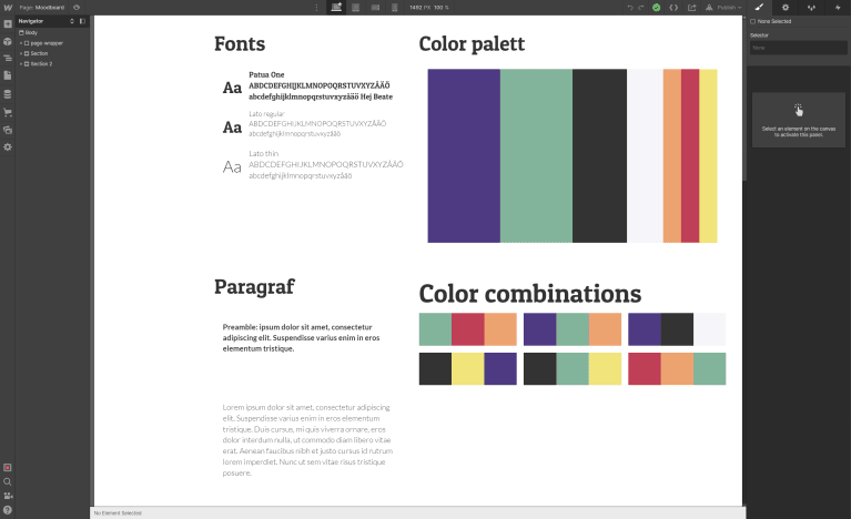
But back to the tips I promised in the first paragraph! My first tip is to build a design system directly in Webflow, it will save a lot of frustration. The smooth thing about having a design system in place is that you can make changes that affect all pages immediately, even if you only make the change in the design system. A design system can look several different ways, but the most common is that it contains a visual guide with colors, fonts, margins etc. But my tip is to invest time in making the system with elements(symbols) that can be reused during the course of the project instead of making new elements for each page. It goes faster and makes the design consistent, which also makes it easier for the end user.

Symbols
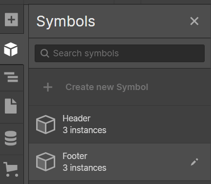
If you are familiar with Figma, you will probably like when I say that there is something called symbols in Webflow, which work in the same way as Figma’s components. This means that you can create buttons, turn them into symbols that can then be used in your pages that you built. And basically they come from the same element from the beginning. If you want to change the appearance on the buttons, you can do it in one place and then it changes everywhere – easy! Building your design system with symbols this way means you’ll have a whole library where you can drag and drop your designed symbols into your pages – i don’t think it could get any smoother?

Classes
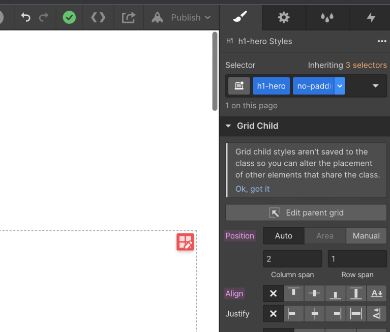
Webflow has classes which I could loosely translate to labels on the design you produce. It’s much the same idea as with symbols – create and reuse to be more efficient. As soon as you design an element on your page, a class is automatically created with the properties you created. You can also create so-called combo classes. I’ll give an example so it will hopefully be easier to follow. An example is that you can use a class for how much margin and padding there should be between elements. But in one specific place, you don’t want any padding at all. Then you first add the global class (because you want the margin) and afterwards you add a class and remove the padding – you have made a combo class! If you find later in the project that you want to change properties in the global class, the changes will take effect, just like with symbols.

Summary
Here is my summary of what a beginner in Webflow should think about in order to work in a structured way:
- Make a design system directly in Webflow
- Use symbols instead of designing new elements on each page
- Using classes in an efficient way to design and adjust the design in several places at the same time
Is Webflow good?
Yes, we think so. It is very flexible and I, as a designer, have full control. There are also many sources to ger your knowledge from. Webflow University is perfect to use when learning Webflow. There are both videos and articles to read, just choose the way! And if you can’t find the answer yo your question, there are also tons of questions and answers in the forums.
Follow the link to see examples of sites built with Webflow:
