Migrated article
This article was migrated from an older iteration of our website, and it could deviate in design and functionality.
6 minutes
This article assumes a basic knowledge of TypeScript and React, with the following required tooling:
As a web developer you may at times find yourself concerned about optimizing the user experience while trying to implement design templates that focus more on the "look and feel" of a website or application. Nowadays there already exists countless of ready-made libraries out there that might be able to help you, you just have to find them.
We'll work with one example of this where you have been tasked with implementing a horizontally scrollable list of items, with the caveat that the list's scrollbar should be made hidden or smaller in all screen sizes. The result is a nice-looking list of items without the not-so-nice-looking scrollbars of desktop browsers.
The first issue you may face here is how to make the list look scrollable now that it no longer has a clear scrollbar. One way to achieve this is to tweak the list item's widths such that the last visible item is clearly cut-off, indicating that there is more to come if you scroll the list.
The next issue, which is the main focus of this article, is to actually make the list scrollable for the typical user. Without a scrollbar the list is difficult to scroll on desktop computers. Using a mouse on a Windows computer you would normally need the mouse to have a builtin tiltable mousewheel that supports horizontal scrolling. Or you would have to hold in shift and scroll the mousewheel to scroll horizontally, a feature which most users don't know of or don't use.
Let's try another way to achieve scrolling of the list by implementing a touch slider. We'll use the NPM package Swiper, and in this case we'll try it out in a standard React typescript application.
First off, setup a basic React typescript application using create-react-app and add the Swiper NPM package.
yarn create react-app my-swiper-app --template typescript
cd my-swiper-app
yarn add swiper
yarn start
Next, replace the contents of App.tsx with a list containing a few list items...
import React from "react";
import "./App.css";

function App() {
  return (
    <div className="my-swiper-app">
      <ul className="my-swiper-list">
        <li>Item 1</li>
        <li>Item 2</li>
        <li>Item 3</li>
        <li>Item 4</li>
        <li>Item 5</li>
        <li>Item 6</li>
      </ul>
    </div>
  );
}

export default App;
... and add some basic styling to App.css.
/* Reset browser styling */
body {
  margin: 0;
}

ul {
  margin: 0;
  padding: 0;
}

/* App styling */
.my-swiper-app {
  align-items: center;
  display: flex;
  height: 100vh;
  justify-content: center;
  padding: 0 24px;
}

.my-swiper-list {
  display: flex;
  gap: 24px;
  list-style-type: none;
  overflow-x: auto;
  width: 1200px;
}

.my-swiper-list > li {
  align-items: center;
  background-color: lightblue;
  border-radius: 12px;
  display: flex;
  flex: 0 0 200px;
  height: 100px;
  justify-content: center;
}
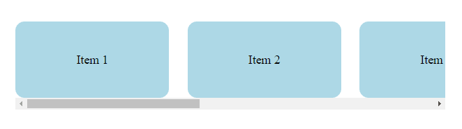
The result should look something like the below list.
Now, let's see how it looks like if we hide the scrollbar. Add the following css.
.my-swiper-list::-webkit-scrollbar {
  display: none;
}

.my-swiper-list {
  -ms-overflow-style: none;
  scrollbar-width: none;
}
Now the list still looks like it should be scrollable since the last item is cut-off, but there's no scrollbar to drag in a desktop browser. Let's add Swiper into the mix and enable its drag cursor. First off, update App.tsx and App.css:
import React from "react";
import { Swiper, SwiperSlide } from "swiper/react";
import "./App.css";

function App() {
  return (
    <div className="my-swiper-app">
      <Swiper
        className="my-swiper-list"
        grabCursor
        slidesPerView="auto"
        spaceBetween={24}
        speed={400}
        touchEventsTarget="container"
        watchOverflow
      >
        <SwiperSlide>Item 1</SwiperSlide>
        <SwiperSlide>Item 2</SwiperSlide>
        <SwiperSlide>Item 3</SwiperSlide>
        <SwiperSlide>Item 4</SwiperSlide>
        <SwiperSlide>Item 5</SwiperSlide>
        <SwiperSlide>Item 6</SwiperSlide>
      </Swiper>
    </div>
  );
}

export default App;
@import "swiper/css/bundle";

/* Reset browser styling */
body {
  margin: 0;
}

ul {
  margin: 0;
  padding: 0;
}

/* App styling */
.my-swiper-app {
  align-items: center;
  display: flex;
  height: 100vh;
  justify-content: center;
  padding: 0 24px;
}

.my-swiper-list {
  width: 1200px;
}

.my-swiper-list .swiper-slide {
  align-items: center;
  background-color: lightblue;
  border-radius: 12px;
  display: flex;
  flex: 0 0 200px;
  height: 100px;
  justify-content: center;
}
Now we should have a working touch slider using the mouse to drag, with a distinct "grab" cursor showing up when we hover over the list.
Let's extend our Swiper implementation with another component showing navigation controls. Add the following code to the new component file MySwiperListControls.tsx.
import React, { useEffect, useState } from "react";
import Swiper from "swiper";
import { useSwiper } from "swiper/react";

export const MySwiperListControls = () => {
  const swiper = useSwiper();

  const [activeIndex, setActiveIndex] = useState(swiper.activeIndex);

  useEffect(() => {
    const callback = (newState: Swiper) => {
      setActiveIndex(newState.activeIndex);
    };

    swiper.on("slideChange", callback);

    return () => swiper.off("slideChange", callback);
  }, [swiper]);

  const buttonClassName = "my-swiper-list-controls-button";

  return (
    <div className="my-swiper-list-controls">
      {swiper.slides.map((_, index) => (
        <button
          className={
            activeIndex === index
              ? `${buttonClassName} ${buttonClassName}--active`
              : buttonClassName
          }
          key={index}
          onClick={() => swiper.slideTo(index)}
        ></button>
      ))}
    </div>
  );
};
Here we make use of Swiper's React hook useSwiper to access the parent component's swiper instance. Note that this hook is not reactive like hooks normally are - this means that updates to the swiper state won't trigger rerenders of our navigation component. To solve this we add a useEffect call to subscribe to events on the swiper instance.
Render the new component in App.tsx, and update App.css with new styling.
@import "swiper/css/bundle";

/* Reset browser styling */
body {
  margin: 0;
}

button {
  border: none;
}

ul {
  margin: 0;
  padding: 0;
}

/* App styling */
.my-swiper-app {
  align-items: center;
  display: flex;
  height: 100vh;
  justify-content: center;
  padding: 0 24px;
}

.my-swiper-list {
  padding-bottom: 30px;
  width: 1200px;
}

.my-swiper-list .swiper-slide {
  align-items: center;
  background-color: lightblue;
  border-radius: 12px;
  display: flex;
  flex: 0 0 200px;
  height: 100px;
  justify-content: center;
}

.my-swiper-list-controls {
  bottom: 0;
  cursor: default;
  display: flex;
  gap: 8px;
  justify-content: center;
  left: 0;
  position: absolute;
  width: 100%;
}

.my-swiper-list-controls-button {
  background-color: lightgray;
  border-radius: 4px;
  cursor: pointer;
  height: 20px;
  width: 20px;
}

.my-swiper-list-controls-button--active {
  background-color: lightskyblue;
  cursor: default;
  width: 30px;
}
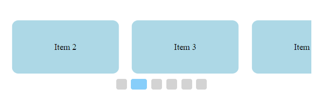
Now you should see the following clickable navigation buttons under the list items.
And that's it for this particular component. To further improve the user experience you could try to add navigation arrows to the left and right of the list, which would take you through all the slides one by one.
