Render more breakpoints with Adaptive Images
3 minutes
It's a fairly common requirement to render responsive images using more than two breakpoints, i.e. more than tree different screen sizes.
While there's no built-in rendering for an arbitrary number of breakpoints in Adaptive Images, it can easily be achieved by rolling your own HTML.
Render AdaptiveImage with additional breakpoints
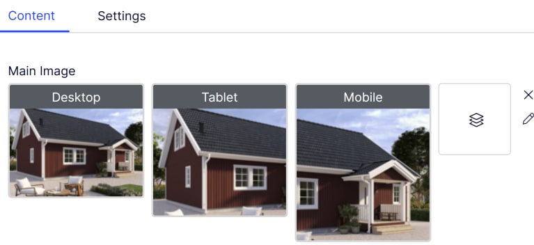
This example is based on a Razor template in a headful Optimizely implementation where we have a content type with the following AdaptiveImage property:
[Display(Name = "Main Image")]
[Proportions(7, 4, FormFactor.Large)]
[Proportions(4, 3, FormFactor.Medium)]
[Proportions(1, 1, FormFactor.Small)]
[Size(3200, FormFactor.Large)]
[Size(1200, FormFactor.Medium)]
[Size(800, FormFactor.Small)]
public virtual AdaptiveImage MainImage { get; set; }
First, we define a number of breakpoints:
(int From, int ImageSize, FormFactor FormFactor)[] breakpoints = {
    (0, 419, FormFactor.Small),
    (420, 767, FormFactor.Small),
    (768, 1023, FormFactor.Medium),
    (1024, 1199, FormFactor.Medium),
    (1200, 1439, FormFactor.Large),
    (1440, 1919, FormFactor.Large),
    (1920, 2560, FormFactor.Large),
    (2561, 3200, FormFactor.Large),
};
Next, we iterate over these breakpoints, outputting a <source> element for each image within our <picture> element.
For the smallest breakpoint, i.e. the one starting from zero width, we instead render the initial <img> element.
@if(Model.MainImage.IsSet())
{
    // The default image, i.e. the smallest one.
    string? defaultImageUrl = null;

    <picture>

        @foreach (var breakpoint in breakpoints.OrderByDescending(breakpoint => breakpoint.From))
        {
            string imageUrl = Model.GetImageRenderSettings(x => x.MainImage, breakpoint.FormFactor)
                                   .ResizeToWidth(breakpoint.ImageSize)
                                   .GetUrl();

            if (breakpoint.From == 0)
            {
                defaultImageUrl = imageUrl;

                continue;
            }

            <source srcset="@imageUrl" media="(min-width: @(breakpoint.From)px)">
        }

        <img src="@defaultImageUrl" alt="A very responsive image" />

    </picture>
}
Note: We use the Small image of our MainImage property for the smallest breakpoints, the Medium one for the in-between breakpoints, and finally the Large one for the largest breakpoints.
This means the user (web editor) only has to manage three variants...

...while the resulting markup contains 8 image variants:
<picture>
    <source srcset="{url for 3200px desktop image}" media="(min-width: 2561px)">
    <source srcset="{url for 2560px desktop image}" media="(min-width: 1920px)">
    <source srcset="{url for 1919px desktop image}" media="(min-width: 1440px)">
    <source srcset="{url for 1439px desktop image}" media="(min-width: 1200px)">
    <source srcset="{url for 1199px tablet image}" media="(min-width: 1024px)">
    <source srcset="{url for 1023px tablet image}" media="(min-width: 768px)">
    <source srcset="{url for 767px mobile image}" media="(min-width: 420px)">
    <img src="{url for 419px mobile image}" alt="A very responsive image" />
</picture>
This way, you can even add additional parameters, for example to render 2x images for retina screens etc.
Render a SingleImage as a responsive image
Let's say we instead have a SingleImage property that we want to render as a responsive image:
[Display(Name = "Product Image")]
[Proportions(4, 3, "Landscape", true)]
[Proportions(2, 3, "Portrait")]
[Size(3200)] // Allow rendering up to a maximum width of 3200px
public virtual SingleImage ProductImage { get; set; }
While we can use a <picture> element, we can also make use of an <img> element with srcset and sizes attributes as an alternative approach:
@if(Model.ProductImage.IsSet())
{
    // Define breakpoints and their image size
    // SingleImage properties don't have any form factors,
    // so we only define minimum screen and image widths
    (int From, int ImageSize)[] breakpoints = {
        (0, 419),
        (420, 767),
        (768, 1023),
        (1024, 1199),
        (1200, 1439),
        (1440, 1919),
        (1920, 2560),
        (2561, 3200),
    };

    List<string> srcset = new(),
                 sizes = new();

    string? defaultImageUrl = null;

    foreach (var breakpoint in breakpoints.OrderByDescending(breakpoint => breakpoint.From))
    {
        ImageRenderSettings image = Model.GetImageRenderSettings(x => x.ProductImage)
                                         .ResizeToWidth(breakpoint.ImageSize);

        string imageUrl = image.GetUrl();

        srcset.Add($"{imageUrl} {image.Dimensions.Width}w");

        if (breakpoint.From == 0)
        {
            sizes.Add($"{breakpoint.ImageSize}px");

            defaultImageUrl = imageUrl;
        }
        else
        {
            sizes.Add($"(min-width: {breakpoint.From}px) {breakpoint.ImageSize}px");
        }
    }

    <img srcset="@string.Join(",", srcset)"
         sizes="@string.Join(",", sizes)"
         src="@defaultImageUrl"
         alt="A single image turned responsive" />
}
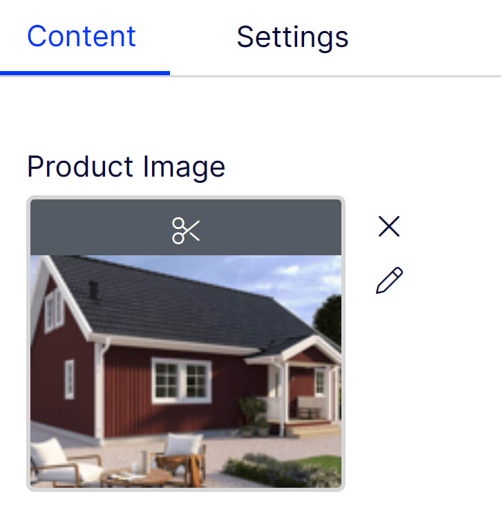
In this case, the image appears as a single variant in edit mode...

...while the resulting <img> element tells the browser which image size to load for each screen size:
<img srcset="{image url for 3200px image} 3200w,
             {image url for 2560px image} 2560w,
             {image url for 1919px image} 1919w,
             {image url for 1439px image} 1439w,
             {image url for 1199px image} 1199w,
             {image url for 1023px image} 1023w,
             {image url for 767px image} 767w,
             {image url for 419px image}"
     sizes="(min-width: 2561px) 3200px,
            (min-width: 1920px) 2560px,
            (min-width: 1440px) 1919px,
            (min-width: 1200px) 1439px,
            (min-width: 1024px) 1199px,
            (min-width: 768px) 1023px,
            (min-width: 420px) 767px,
            419px"
     src="{image url for 419px image}"
     alt="A single image turned responsive" />
Did you know? The advantage with this method is that it tells the browser that all images are identical, except for their sizes. This means the browser won't load an image if it has already loaded a larger version of it - it can simply resize that one instead of wasting additional bandwidth.

Ted Nyberg
Ted is the founder of ted&gustaf, a technical architect and Optimizely MVP with over 15 years of experience designing and leading the development of complex digital platforms.