Case Eltel Networks

Project summary

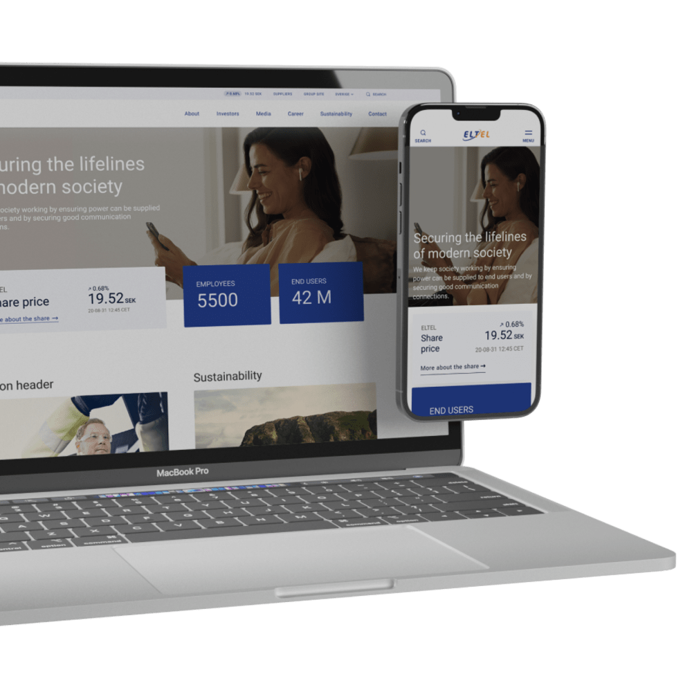
Eltel, a key enabler of society's critical infrastructure, needed a modernized digital presence that could both support investor communication and appeal to potential employees. By redesigning and separating their group and market websites, we created a streamlined and purpose-driven experience—improving usability for both end users and editors while maintaining brand consistency.

Visit site

Project overview

Impact

  • Clearer segmentation with improved target group relevance and navigation paths.

  • Improved editor experience with intuitive content management, reducing errors and preserving design consistency.

  • Enhanced user journey thanks to simplified navigation and a minimalist interface that prioritizes information clarity.


Scope 

Digital strategy, UX design, Development


Platform

Optimizely 

Modernizing Eltel’s digital presence

By ensuring good communication connections and that electricity is delivered to end users, Eltel ensures that society works. They secure the lifelines of modern society.

The challenge

For Eltel, the conditions were clear. The existing website had fallen behind and felt visually outdated. The primary purpose of their web presence is to make investor-related content available, but also to attract potential employees. To meet these needs, there are pages for each market and for the Group.

To future-proof the platform, an update was necessary. The user experience for the end-user was equally as important as the experience of the editor. Partly to keep the brand together, and not leave design decisions to the editor, partly to make content editing more intuitive and to help prevent mistakes. 

Two men in safety gear standing next to a radio tower.
A laptop and phone with a screen on.

The solution

Through an iterative process, a new website was developed that gives a more modern impression, but at the same time minimalistic and with a focus on delivering what the user is looking for through a balance between spaciousness and clarity. This process included steps such as;

  • Moodboard to set a design direction and modify colors and graphic elements for the digital
  • Basic wireframes to cover the primary user flows and information architecture
  • A design concept
  • Implementation of design concepts on the CMS platform

A decision that was made for the project was to separate eltelgroup.com and eltelnetworks.com. By doing so we were able to more distinctly segment the target groups. We used the market landing page as a space to guide the user correctly depending on the purpose of the visit, where we used a so-called splash area to provide distinct shortcuts to each market and group side.

A color palette with different shades of colors.

The benefits

A clearer segmentation between target groups and visitor purpose has made it easier for users to find their way. Scaling down and simplifying the main navigation has led to a clearer and more focused customer journey while users still have access to secondary measures such as search and changing language. The minimalist listings for IR calendar, financial reports and press releases provide a good overview and scannability in accordance with the target group's preference.

The insights

A close collaboration with the customer made it easy to handle changes in requirements and to maintain a shared view of the direction of the design and implementation. Proper communication and efficient decision-making are keys to an efficient work process. At the same time, the customer put a lot of trust in us, which gave us the opportunity to propose changes based on the actual needs and not just what was in the initial requirements specification.

A solar panels and wind turbines in a field.
A screenshot of a computer.

Let's talk about projects

A person sitting on a wooden bench – Gustaf Lindqvist