Rendering Adaptive Images in Episerver
9 minutes
Introduction
This post assumes you're familiar with the Adaptive Images add-on for Episerver, which is available on the Episerver App Marketplace. If not, I recommend you start with the introduction to Episerver Adaptive images.
One original image, infinite formats
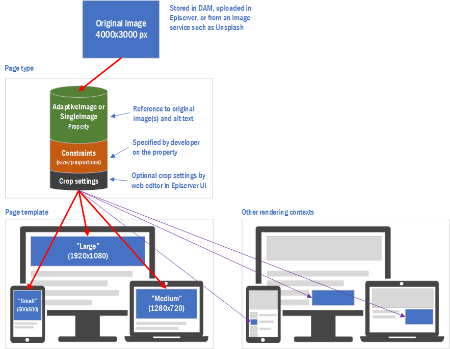
The core concept is based on original (high-resolution) images that are rendered differently depending on context.
The original images can come from an external image source (such as a DAM or web service) or be uploaded in Episerver.
Image properties can be decorated with constraints, such as minimum size and/or proportions, which in turn determines which original images "qualify" (i.e. are large enough) and how the images can/should be cropped.
Below is an example of how one original image is rendered in six different ways depending on context:

Property declaration
Constraints, like minimum size and proportions, are specified using attributes. Here is an example of an AdaptiveImage property with very specific constraints:
[Display(Name = "Hero Image", GroupName = SystemTabNames.Content)]
[RequiredImage] // All form factors and alt text are required
[CultureSpecificImage(AlternateText = true, Images = false)] // Only alt texts are culture-specific
[DisplayNames(Large = "/formfactors/hero/large", Medium = "/formfactors/hero/medium", Small = "/formfactors/hero/small")] // Localized form factor names
[Proportions(16, 9, FormFactor = FormFactor.Large | FormFactor.Medium)] // Widescreen proportions for large and medium screens
[Proportions(1, 1, FormFactor = FormFactor.Small)] // Mobile design uses a square image
[Size(1920, FormFactor = FormFactor.Large)] // For large screens, we need an image at least 1920x1080 (no need to specify height as we have a proportions constraint)
[Size(1280, FormFactor = FormFactor.Medium)] // 1280 pixels is enough for the tablet design
[Size(767, FormFactor = FormFactor.Small)] // 767 pixels is enough for the mobile design
public virtual AdaptiveImage HeroImage
{
    get; set;
}
We can also use SingleImage properties for cases where there's no need for web editors to be able to specify different images and/or croppings for different form factors:
[Display(Name = "Background Image", GroupName = SystemTabNames.Settings)]
[RequiredImage(AlternateText = false)] // Image required, alt text isn't
[CultureSpecificImage]
[Proportions(16, 9)]
[Size(1920)]
public virtual SingleImage BackgroundImage
{
    get; set;
}
The attributes are all optional, but let's go through them one by one to see what they do:
RequiredImage specifies that this property must be set. For AdaptiveImage properties we can opt to only require specific form factors. Description ("alt text") is required by default for required images, but it can be turned off through the attribute's AlternateText property.
CultureSpecificImage specifies that an image is localizable. This makes both images and alt text localizable by default, but we can choose to make only one or the other localizable through the attribute's AlternateText and Images properties.
DisplayNames simply sets the names of each form factor in the Episerver UI. The names can be hardcoded, or like in this case, map to Episerver translations. This attribute isn't applicable for SingleImage properties.
Proportions specifies the width to height ratio of images. This in turn affects how images are cropped by default, and to which proportions a web editor may manually crop an image.
Size specifies the minimum size allowed for an image (or cropping thereof).
Size and Proportions attributes have a FormFactor property which can be set to make the attribute only apply to specific form factor(s). If not set, the property will apply to all form factors. The FormFactor property does not apply for SingleImage properties.
Note: The Size attribute only specifies the minimum image size of the image(s) selected or cropped by web editors. It doesn't necessarily equate to the size of our rendered images, as we will see next.
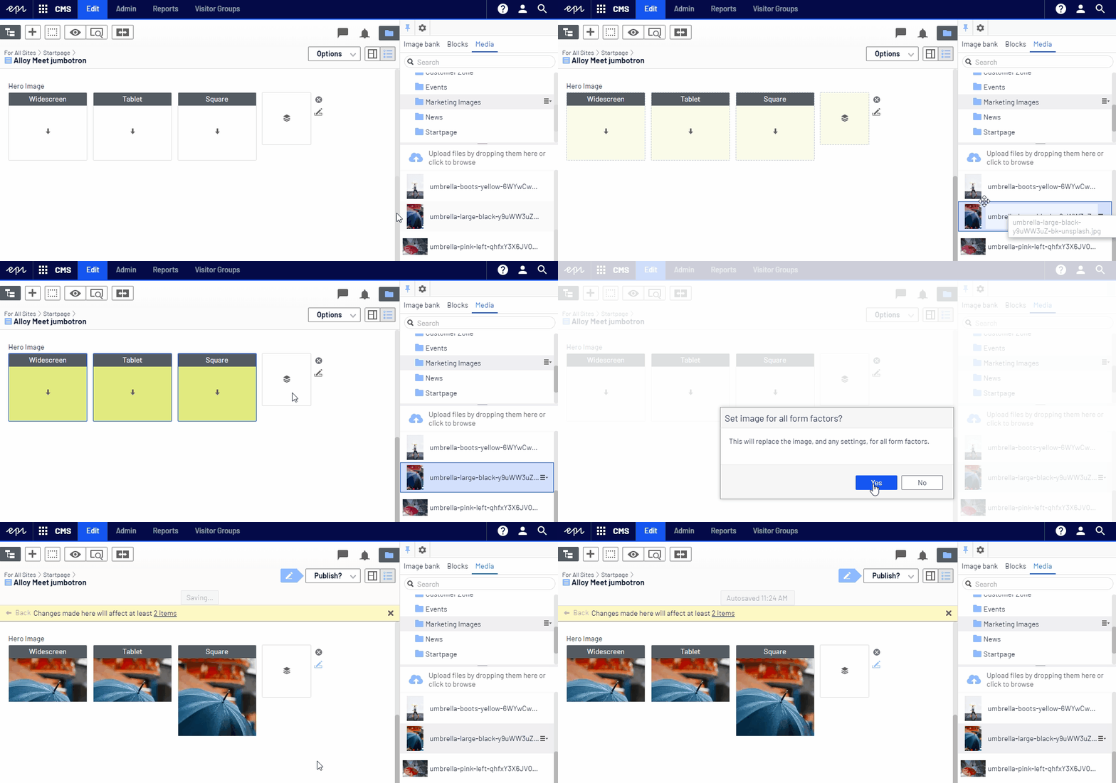
Selecting image(s) for our hero image property
If we drag and drop an image (from the Media or Image Bank widgets) to make it apply to all form factors, we can see from the thumbnails that the image will be cropped according to the proportions attributes:

Rendering the property image(s)
Now, we can use standard no-frills rendering of our adaptive image using PropertyFor:
@Html.PropertyFor(x => x.HeroImage)
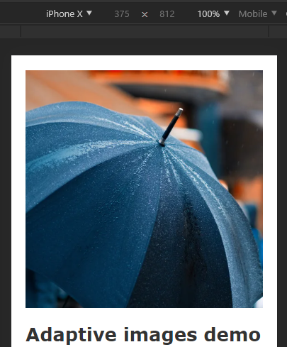
This renders images based on the website's default breakpoints (which also affect the sizes of the rendered images), automatically cropped to the specified proportions (or using cropping set by a web editor, if any).
So, if we switch to a screen size triggering the mobile breakpoint, we'll indeed see the image cropped to a square:

Render suitably sized images
Since not all images are full-width images, we commonly want to specify the desired width of each rendered image instead of having it be determined by the breakpoint sizes.
We can pass parameters to PropertyFor to explicitly set the desired width of the image for each form factor/screen size:
@Html.PropertyFor(m => m.HeroImage,
   new {
      largeWidth = 1200, // Image width for the largest breakpoint
      mediumWidth = 979, // Image width for the medium breakpoint
      smallWidth = 500 // Image width for the smallest breakpoint
})
Note: There is no need to specify image height as images will be proportionally scaled.
Use context-specific breakpoints
While we can change the site-wide default breakpoints using the AddonSettings class, we can easily apply different breakpoints when rendering a specific image property.
Below we override the default "large" breakpoint and set it to 980 pixels:
@Html.PropertyFor(m => m.HeroImage,
   new {
      largeBreakpoint = 980, // Override default breakpoint for desktop
})
Generating image URLs for custom rendering
While PropertyFor by default renders <picture> and <img> elements, for AdaptiveImage and SingleImage properties respectively, there are many cases where you need complete control of the rendered markup.
To do that you need to be able to simply get the URLs of the images to render. One example would be using an image as a background image.
For this you use the ImageRenderSettings class. It can be used to apply transformations to an image using a fluent syntax. When done, the GetUrl() method returns the URL of the transformed image.
URL for image based on specified constraints
If you want the URL of an image honoring any image constraints, including any explicit cropping by a web editor, simply use the GetImageRenderSettings extension method for the image you would like to render:
@{
    // Generate URL for a 600px image honoring any proportions constraints and crop settings specified by web editor
    var backgroundImageUrl = Model.GetImageRenderSettings(x => x.HeroImage.Large)
                                  .ResizeToWidth(600)
                                  .GetUrl();
}

<div style="background-image: url(@backgroundImageUrl)">

</div>
Note: You need to specify a specific SingleImage, i.e. a specific form factor if rendering an image from an AdaptiveImage property.
URL for custom image format circumventing constraints
You may want to render an image with specific proportions and size, regardless of any constraints or croppings applied to the image property.
For example, the following would generate a URL (based on the original image of the "Large" form factor) for a widescreen (16:9) image with a width of 600 px:
@{
    // Generate URL for a 16:9 image with a width of 500px based on SingleImage property regardless of constraints or manual cropping
    var widescreenBackgroundImageUrl = new ImageRenderSettings(Model.BackgroundImage)
                                           .Crop(new Proportions(16, 9))
                                           .ResizeToWidth(500)
                                           .GetUrl();
}

<div style="background-image: url(@widescreenBackgroundImageUrl)">

</div>

Ted Nyberg
Ted is the founder of ted&gustaf, a technical architect and Optimizely MVP with over 15 years of experience designing and leading the development of complex digital platforms.