Älvsbyhus
A house purchase is the biggest financial decision many people do in their life, often taking a lot of time and thought. Together with Älvsbyhus, we set out to make the experience simpler.

The challenge
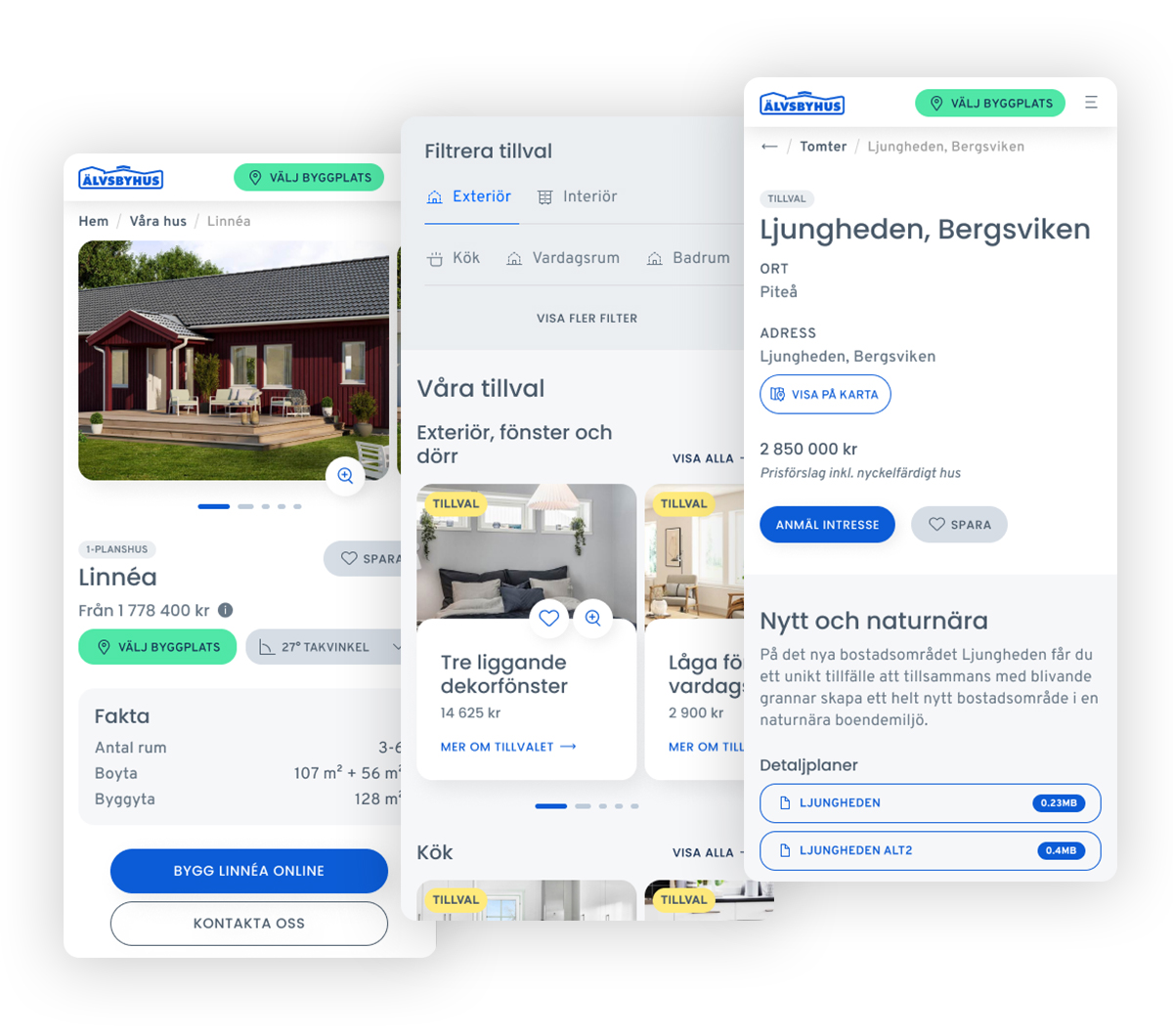
To improve the entire digital communication at Älvsbyhus, a project was initiated to digitize the brand and create a new website to make it easier for potential customers to find their way, understand the value of their offer and in a simple way be able to progress towards a purchase. We previously helped Älvsbyhus build a house configurator where the user can configure different house models according to their wishes. The house configurator is an important tool and already leads to more conversions and we thus needed to make it a larger and more integrated part of the purchase process.
A new house is for most people a rare purchase, but we also wanted to explore in which ways we could incentivize the users to return and make it easier to manage the customer relationship after the purchase. The most important goals include increased conversions, increased brand awareness and increased brand value. These were in turn broken down into the following measurable KPIs;
- A clearer and more consistent web experience
- More leads through the house configurator
- More bookings for digital house showings
- More catalog orders
The solution
A large part of the process of developing a solution is to collect data as a basis for making decisions. It’s as much about understanding the needs of the users as it is understanding the industry and the content editors. Some of the insights that emerged from the data collection were that;
- Half of the visitors leave within 10 seconds, which could mean that it is difficult to understand what you as a user can do and how to move on.
- Two thirds of visitors do not return
- Two thirds of the visitors come from the mobile devices
With these points, among others, as the foundation, we mapped different user goals that we needed to fulfill. Then we made a user survey to validate that these were correct and to find out more information about their needs. With user data behind us, we were able to develop a mood board and wireframes for the solution in parallel.
The moodboard was made to create a direction of the visuals and how to digitally adapt the brand, but also to help give ourselves the tools to create an accessible and inclusive solution.
Wireframes were created to act as the foundation of the information architecture and to ensure that we cover the information needed in the various user flows and always provide relevant paths forward.
By combining the moodboard and the wireframes, we developed a full-scale design concept. The design is primarily more spacious and neutral with strategic use of color to provide a scannable overview and visual guidance for the user.
The benefits
One of the most important changes is a simplified navigation, which makes different content more distinguished from each other. It becomes easier to find what you’re looking for when there are fewer menu options that compete with each other. There is a more intuitive and natural path from start to finish, where any information gaps are filled where needed.
All pages have at least one relevant action early on the page (usually within the first-fold) to proceed. There is support to personalize the content for the user through various choices that affect what is presented. An example is that the choice of building location affects the price and it therefore becomes a better experience by being able to choose the intended location and thus get the correct price from the beginning. The user also has the opportunity to choose how content is presented, where possible, according to their preferences. For example, in a listing of objects, users can select whether they want to see the result on a map, as a list or as images.
The editorial experience has also been simplified through fewer and simpler properties to edit. The flexibility of how to create content is maintained, but with less flexibility in terms of colors and shapes, the editor is relieved of the burden of design decisions and ensures a coherent brand and design experience across the website.
The insights
As in almost all our projects, we worked closely with customers, with regular check-ins to ensure that we always keep the course the same goal. There was a great deal of transparency within the project group where we could lift any obstacles and correct the course based on needs. At the same time, the customer put great trust in us and we were able to work at a good pace. An important insight that we did well in this project was to focus early on creating reusable components to get a high level of consistency throughout the design.
Want to know what the end result looked like?
Visit Älvsbyhus to experience their new and improved website
